MedSwift
Pharmaceutical delivery as easy as ordering groceries

Process
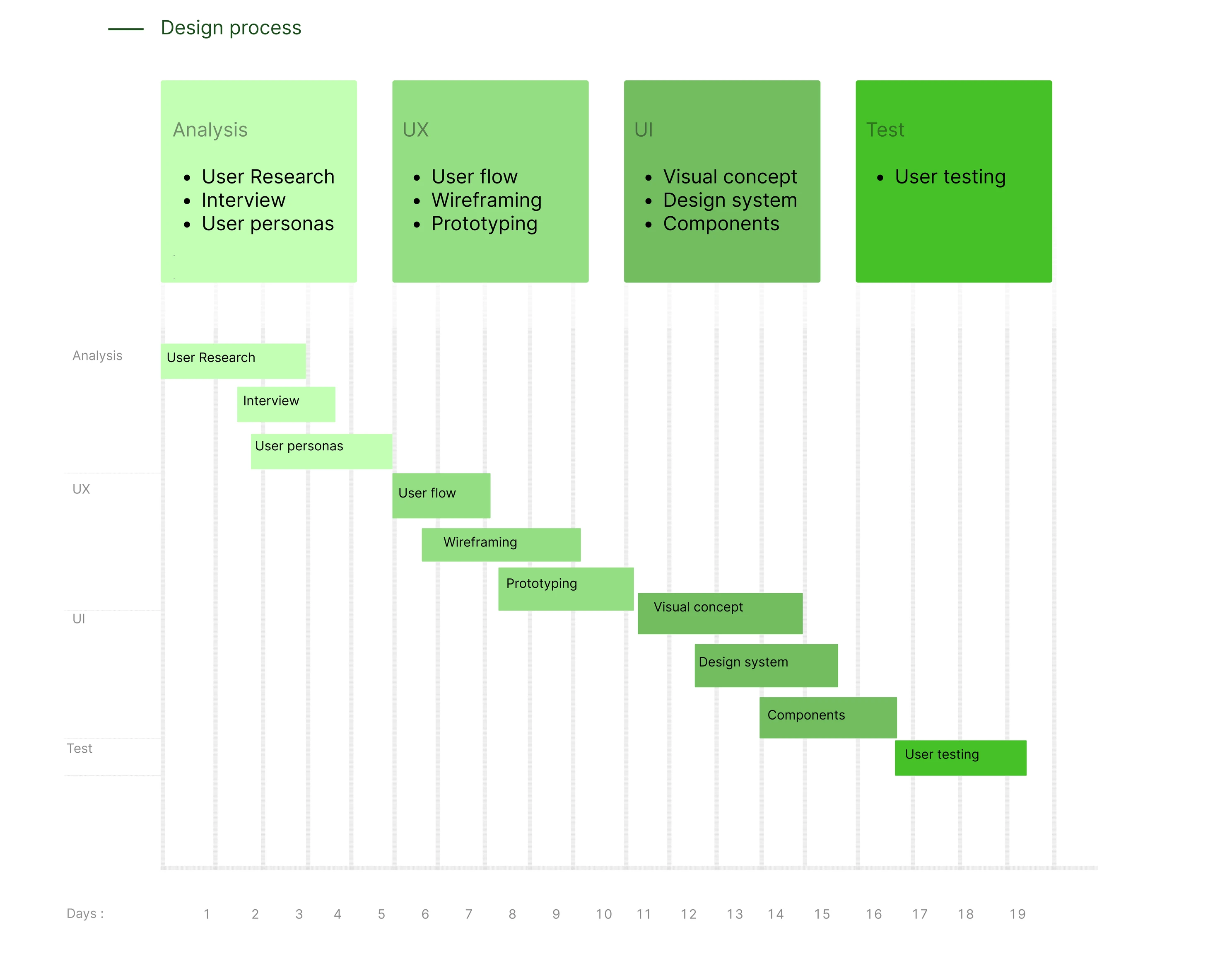
- 01Research
- 02Define
- 03Design
- 04Test
Research
The research phase looked at how people buy medicines today and what stops the process being quick and reliable, using a survey, competitor research and interviews to define the real needs behind a delivery service.
Assumptions
Based on the growth of home delivery services and changing consumer behaviour, it can be assumed that pharmaceutical delivery apps have strong potential to become an essential part of everyday healthcare access. The target audience includes anyone who needs convenient access to medicines and healthcare products. MedSwift is a pharmaceutical delivery app designed to make ordering and receiving medications simple, fast and reliable. Its intuitive interface allows users to access essential healthcare products as easily as ordering everyday items online.
The design focuses on:
- Understanding user needs
- Ease of use
- Clear navigation
- Personalisation
- Continuous improvement through feedback
- Security and privacy
The goal is to create a trustworthy and accessible healthcare experience for all users.
The survey
The survey results showed that 78% of respondents were interested in a pharmaceutical delivery app. Additionally, 34% purchase medicines weekly and 44% do so every two weeks, highlighting the demand for a convenient delivery solution.
Further research and analysis of similar applications helped identify key user needs and essential criteria for the delivery experience.
Interview
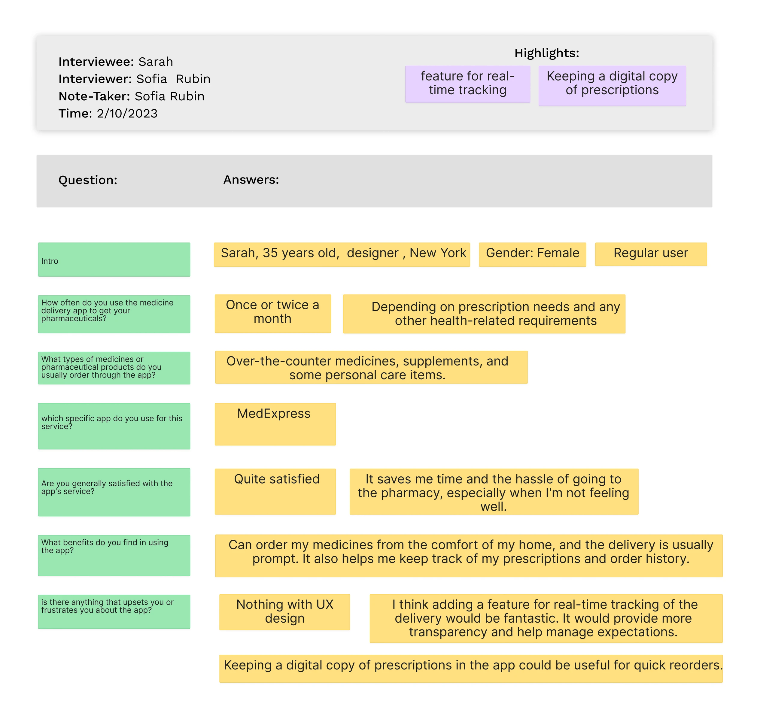
User interviews were conducted to understand goals, expectations and challenges when using pharmaceutical delivery services. The insights helped identify key pain points and areas for improvement. All participant information was anonymised to ensure privacy.
Define
The Define phase turned that research into a clear set of priorities for the design.
Based on surveys, competitor analysis and user interviews, the main design priorities were identified:
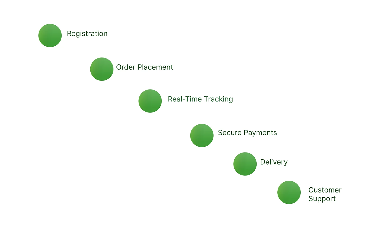
- Simplify ordering: make finding and purchasing medicines quick and easy.
- Improve accessibility: ensure users can easily access healthcare products.
- Build trust: provide clear information, secure payments and reliable delivery updates.
- Reduce complexity: create a smooth journey from search to delivery.
Design
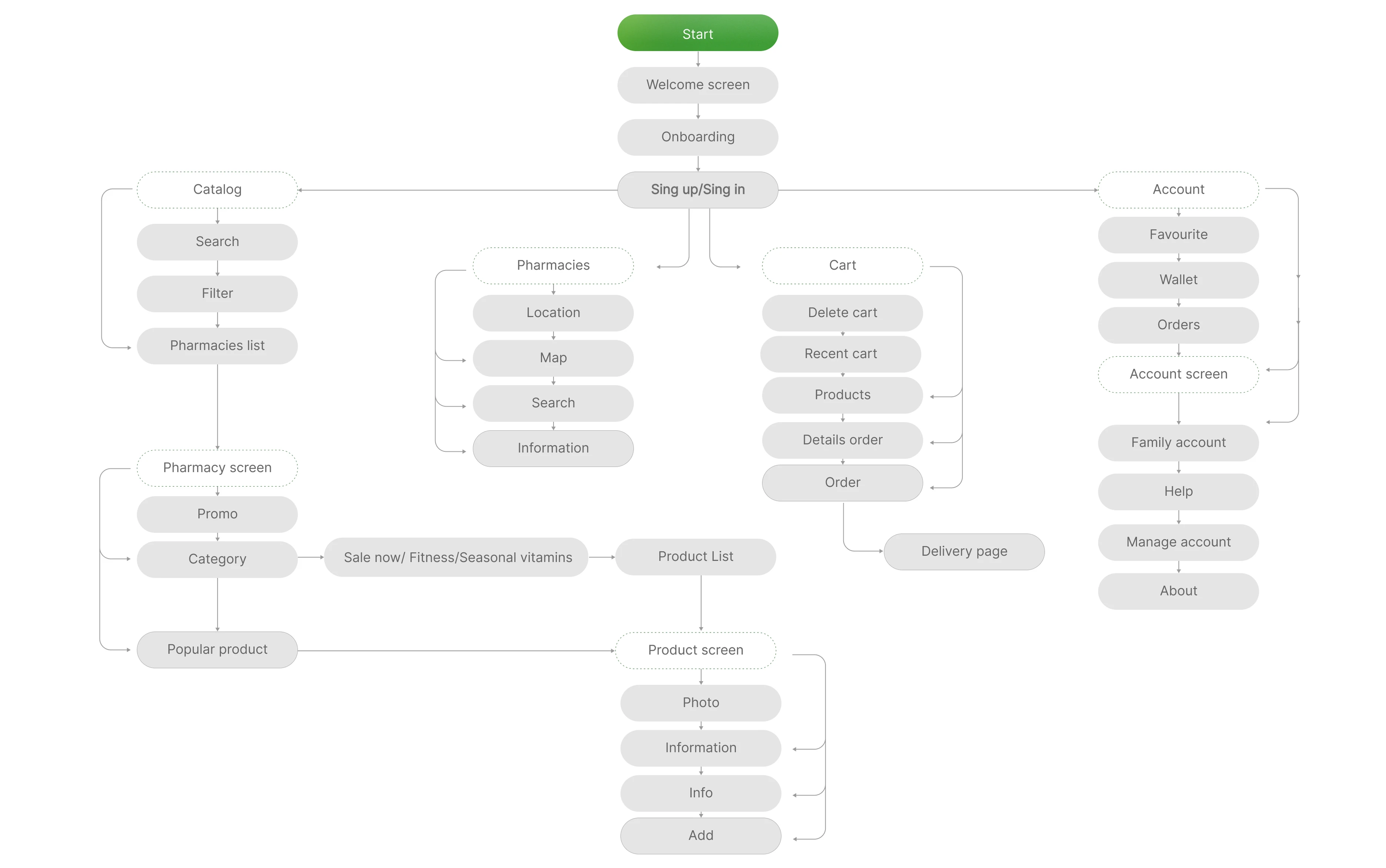
The Design phase built the experience out from the user flow through to prototyping and the finished visual identity.
User flow
Prototyping
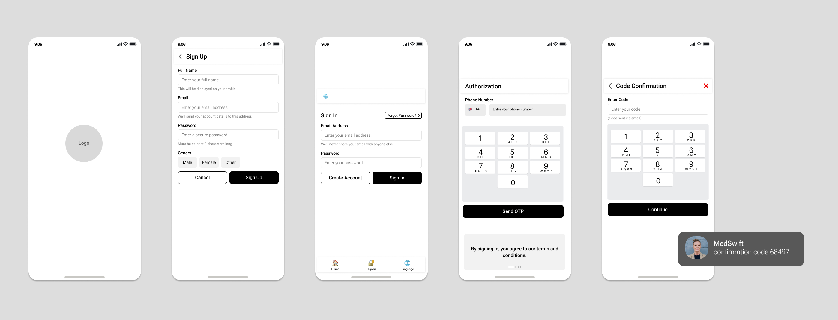
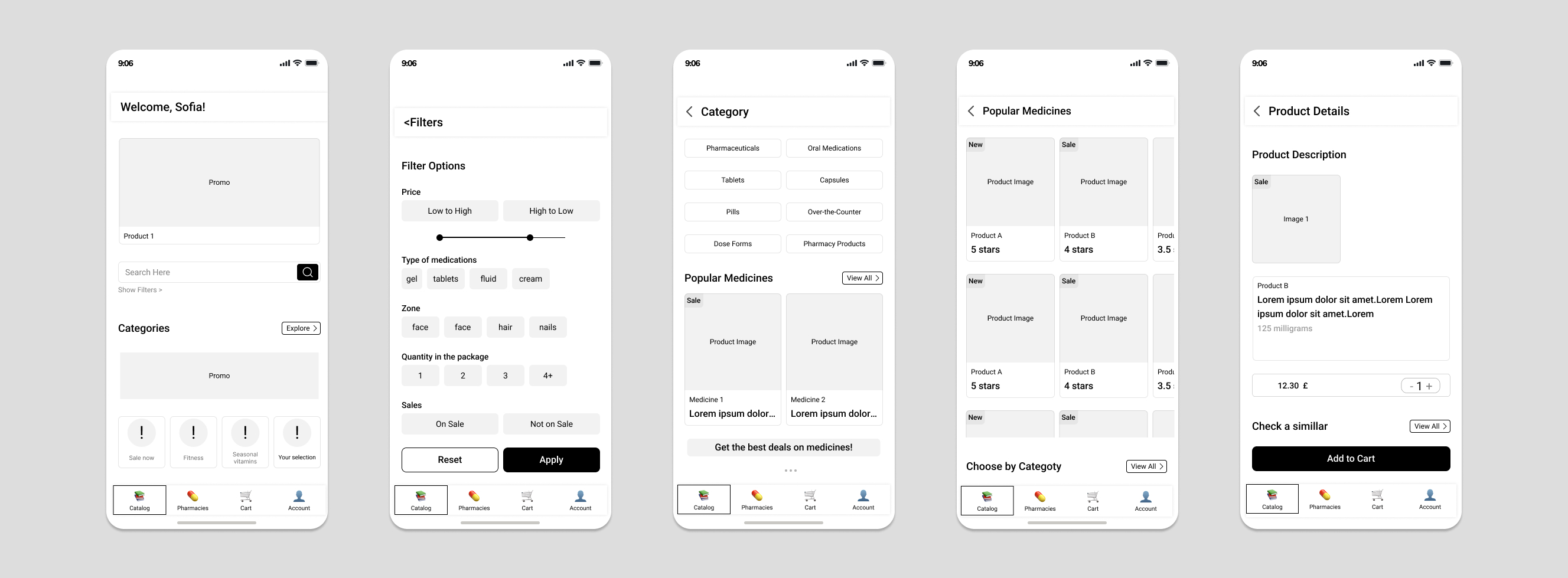
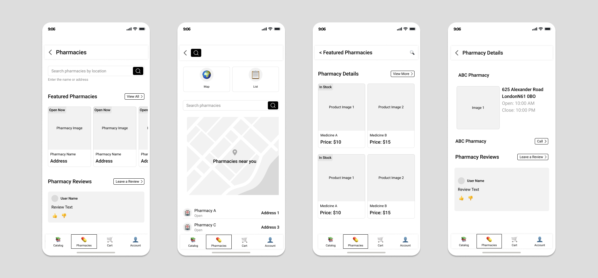
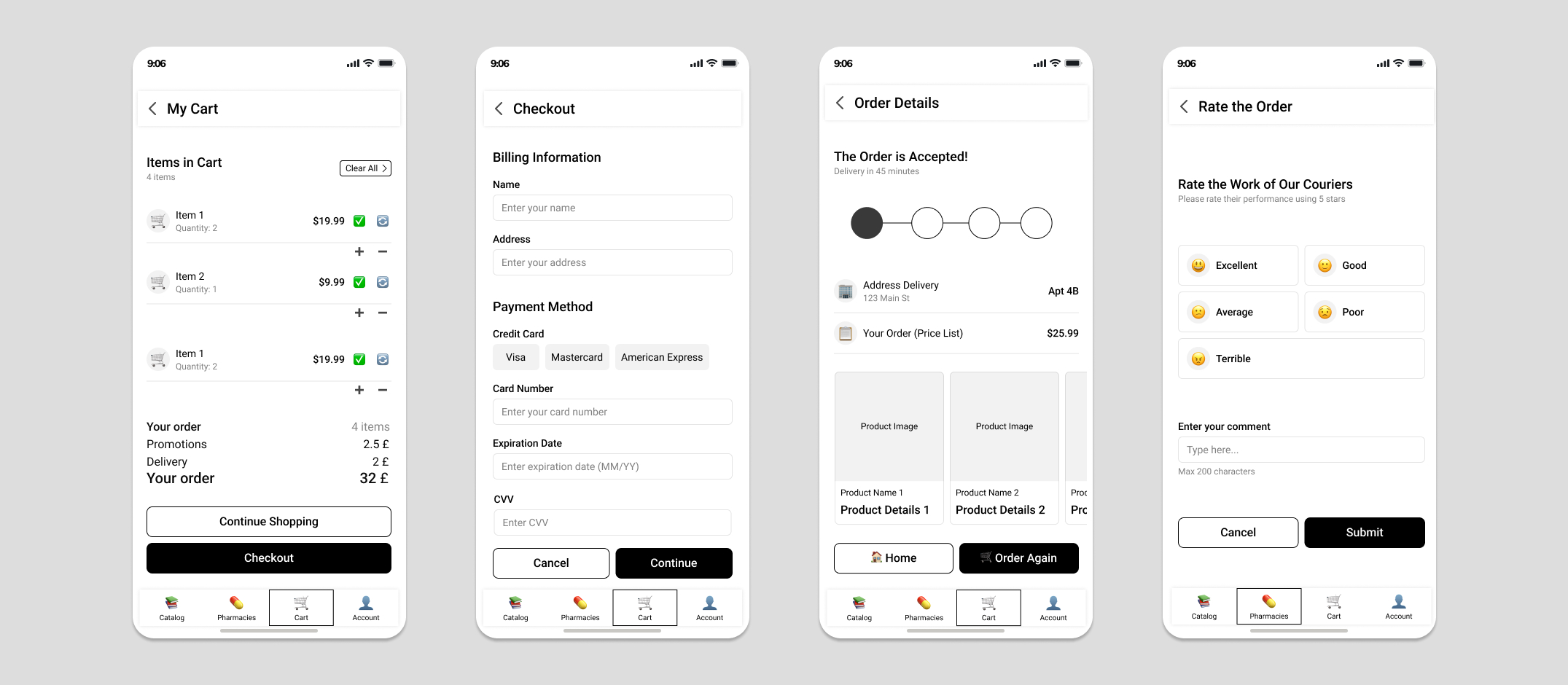
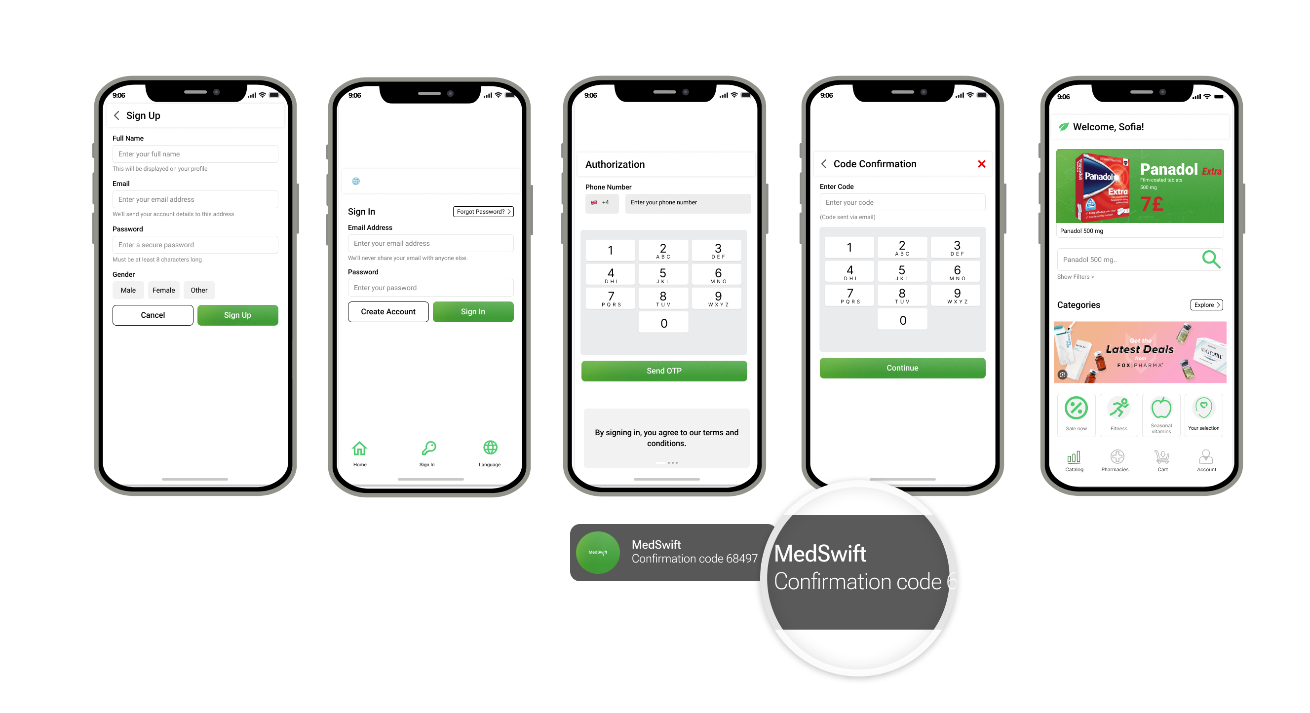
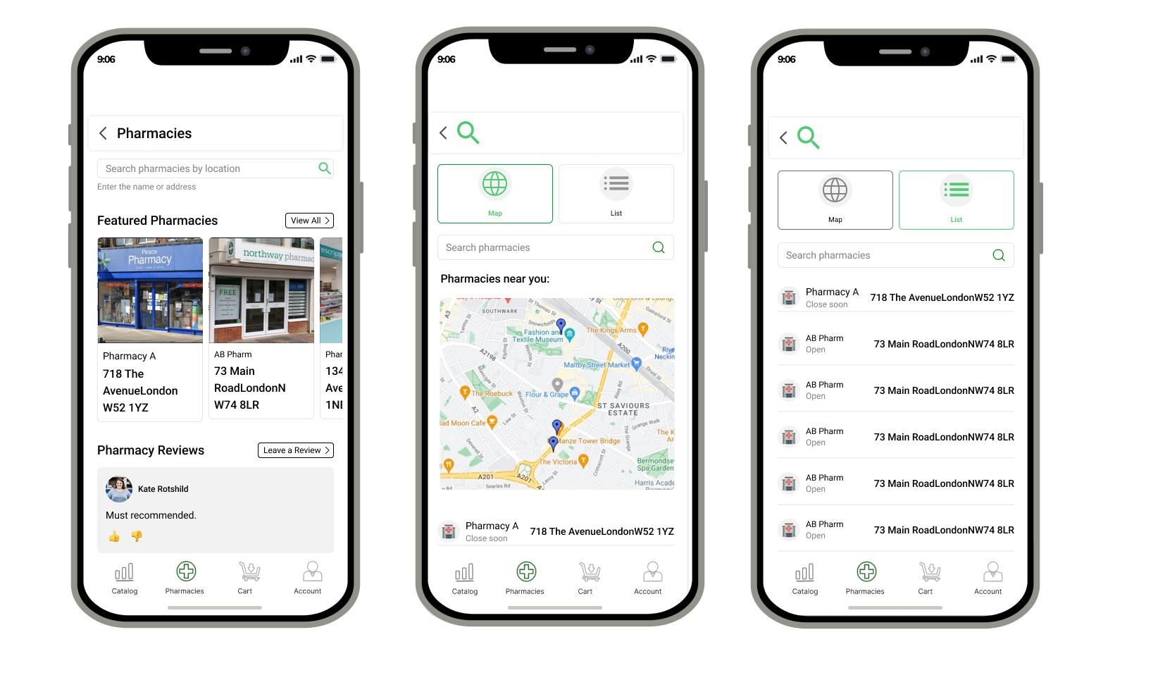
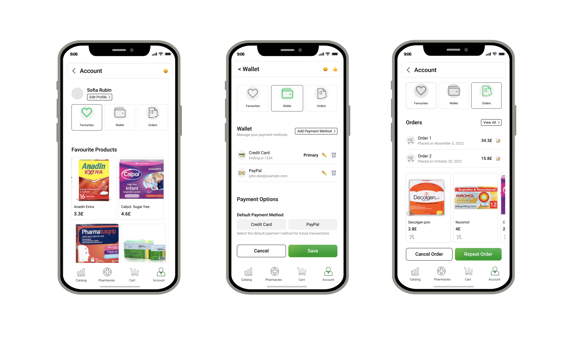
The prototypes were designed to create a clear and intuitive user experience while supporting a smooth user journey. Prototype testing provided valuable insights into user behaviour, helping refine the design and improve the overall experience. Further UI development continued to optimise the product and meet user expectations.
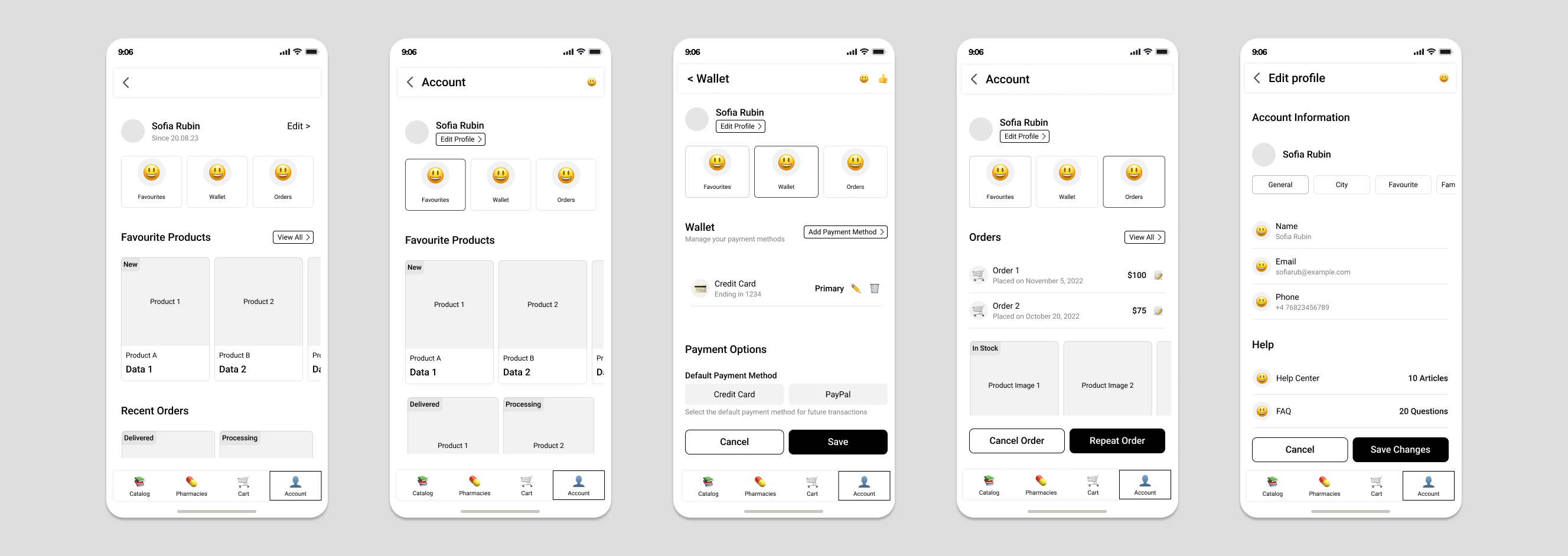
UI design
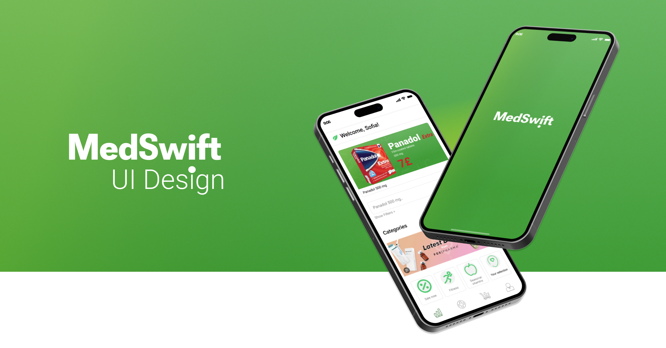
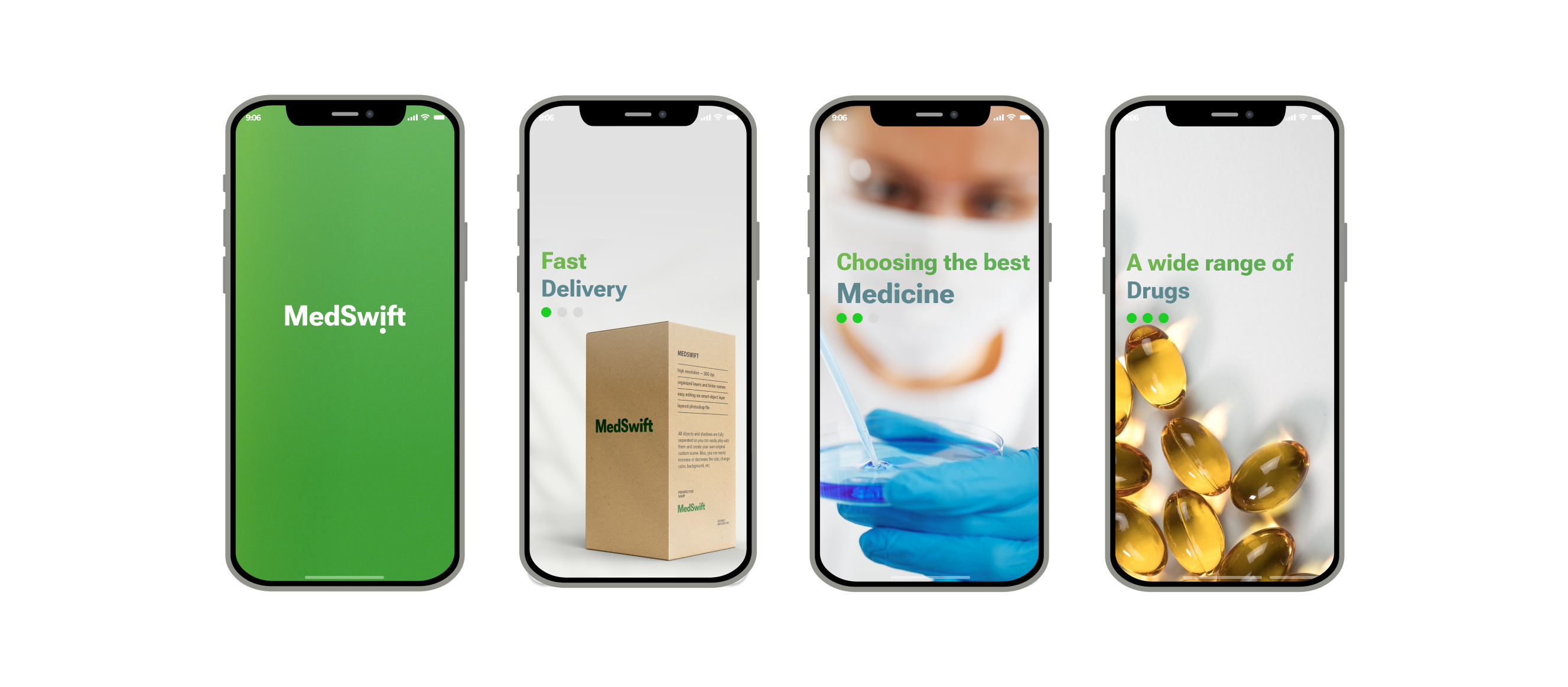
The visual design was developed smoothly, with green selected as the primary colour due to its strong association with healthcare, safety and freshness. To create a more distinctive identity, the colour was enhanced with a gradient and subtle grain texture, adding depth and avoiding a flat appearance.
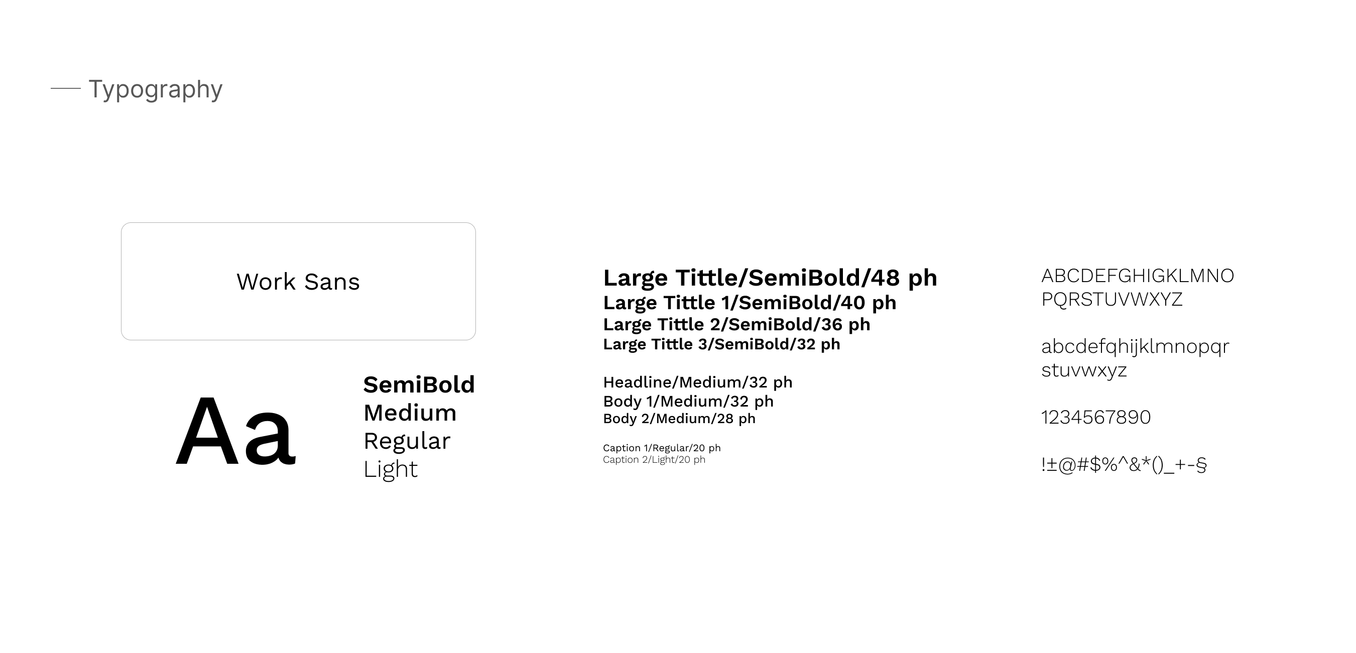
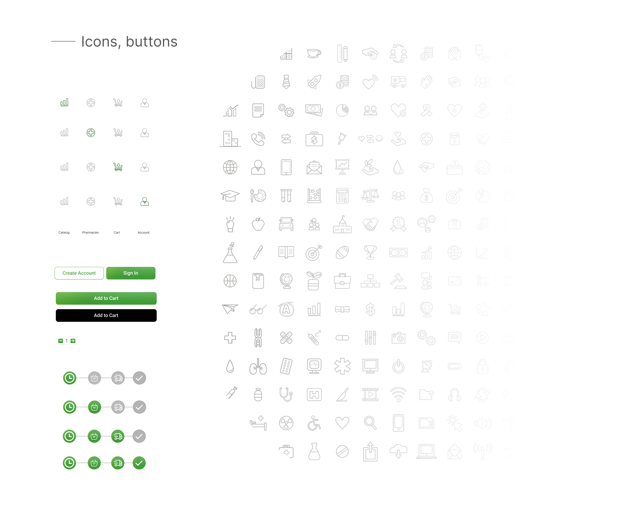
I chose a simple and readable font to create a clear and memorable visual identity. The icons and design elements follow a consistent style with similar line weights, reducing visual complexity and supporting a simple, user-friendly experience.
Test
Prototype testing ran alongside the design work, giving insight into how users behaved and where the journey could be smoother, which fed directly back into the interface.