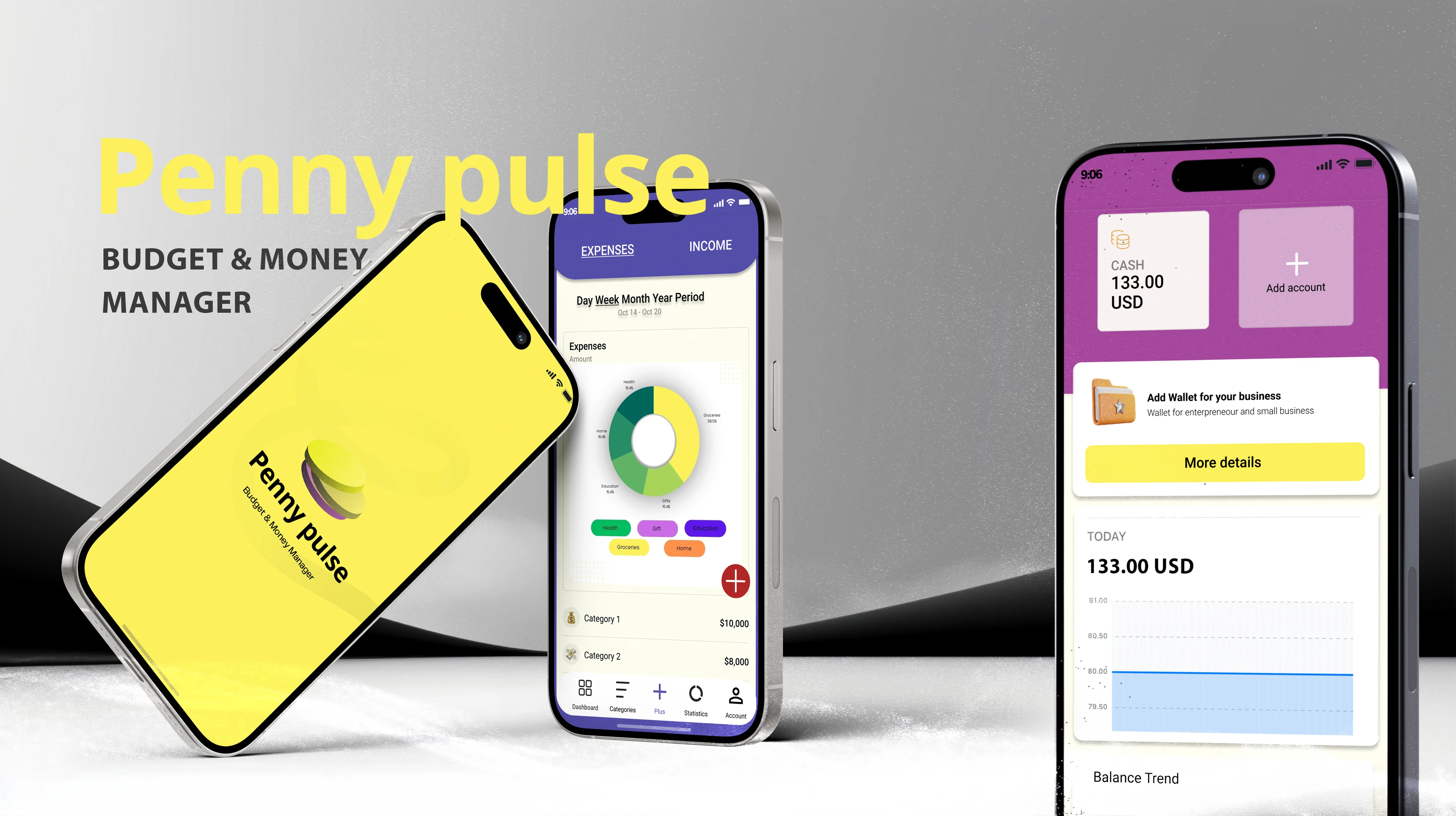
Penny Pulse
A budget & money manager that makes finance feel effortless

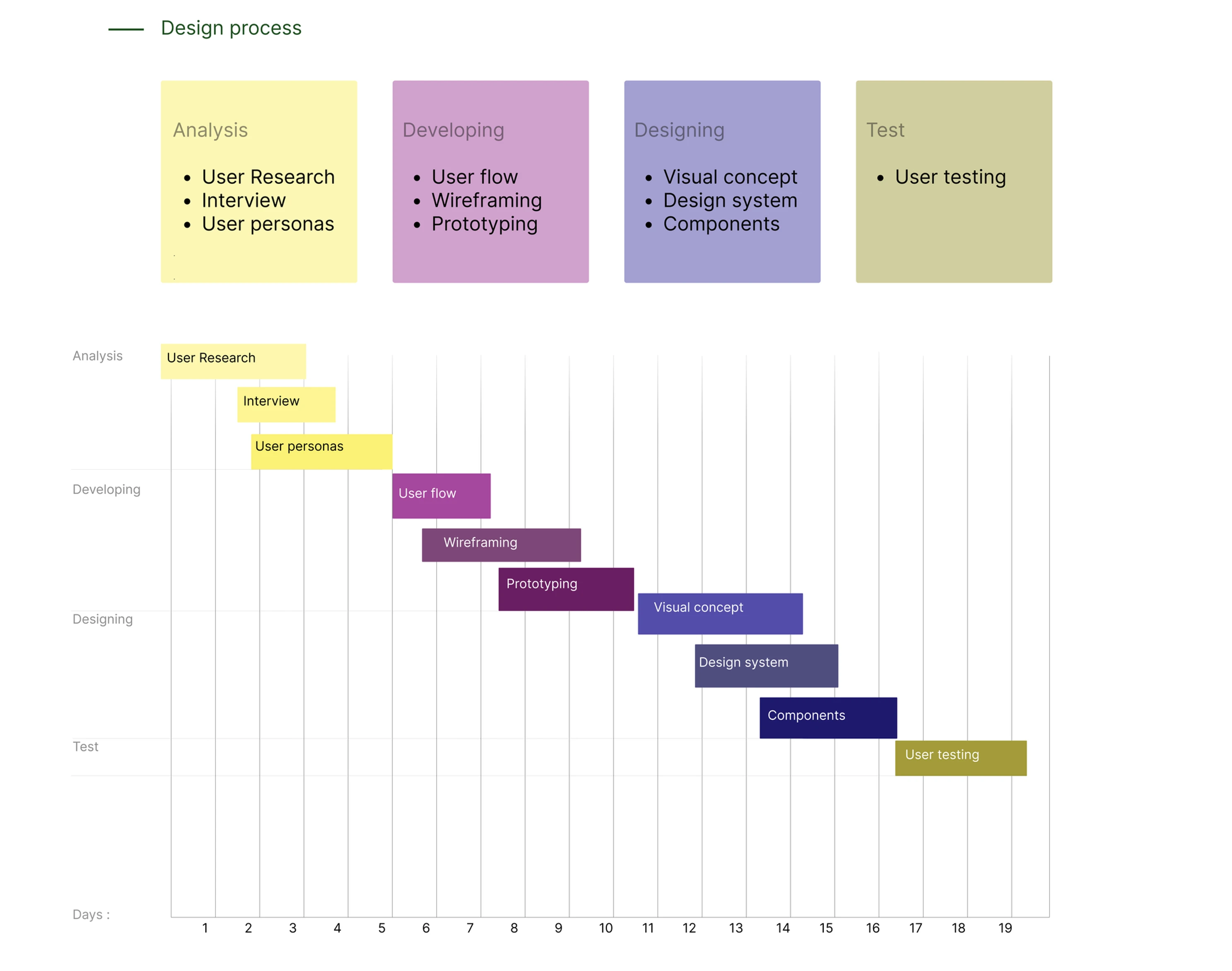
Process
- 01Research
- 02Define
- 03Design
- 04Test
Research
The research phase explored how people currently manage their money and what they expect from a finance app, drawing on desk research, a user survey, competitor comparison and interviews to ground the product in real behaviour.
Assumptions
Based on research into financial behaviour and consumer trends, including insights from Monzo’s analysis (Using topic modelling to understand customer saving goals), it was assumed that interest in personal finance management is increasing, particularly among younger users. Users are becoming more focused on tracking spending, building savings and making informed financial decisions.
This suggests an opportunity for a finance management app that supports both financially confident users and those who need guidance to improve their financial habits.
USP (Unique Selling Point)
Penny Pulse offers a simple and intuitive approach to personal finance management by using AI-powered insights to analyse spending patterns and provide personalised recommendations. Unlike traditional budgeting apps, it combines expense tracking with proactive financial guidance to help users build better financial habits.
The design principles focus on:
- Understanding user needs
- Ease of use
- Clear navigation
- Personalisation
- Continuous improvement through feedback
- Security and privacy
The goal is to create an accessible and trustworthy experience that helps users manage their finances with confidence.
User survey analysis
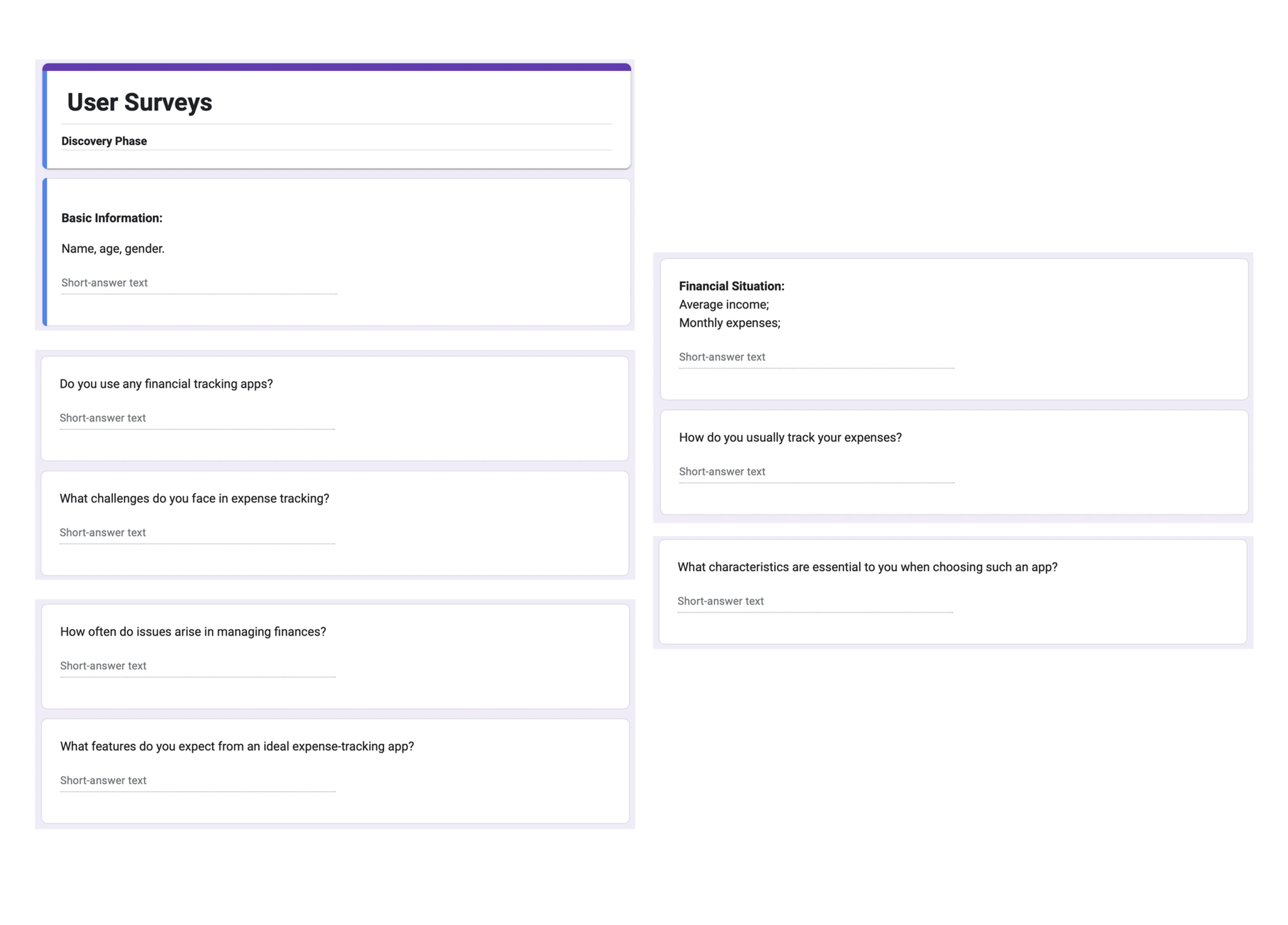
The survey was conducted to understand users’ financial behaviours, goals and expectations when using finance management applications. Participants were recruited through email and social media channels to gather insights from potential users.
The results showed that 62% of respondents already use financial management apps, demonstrating a demand for budgeting solutions. Insights from users aged 16–49, especially younger users (16–28), helped define the target audience and key design priorities.
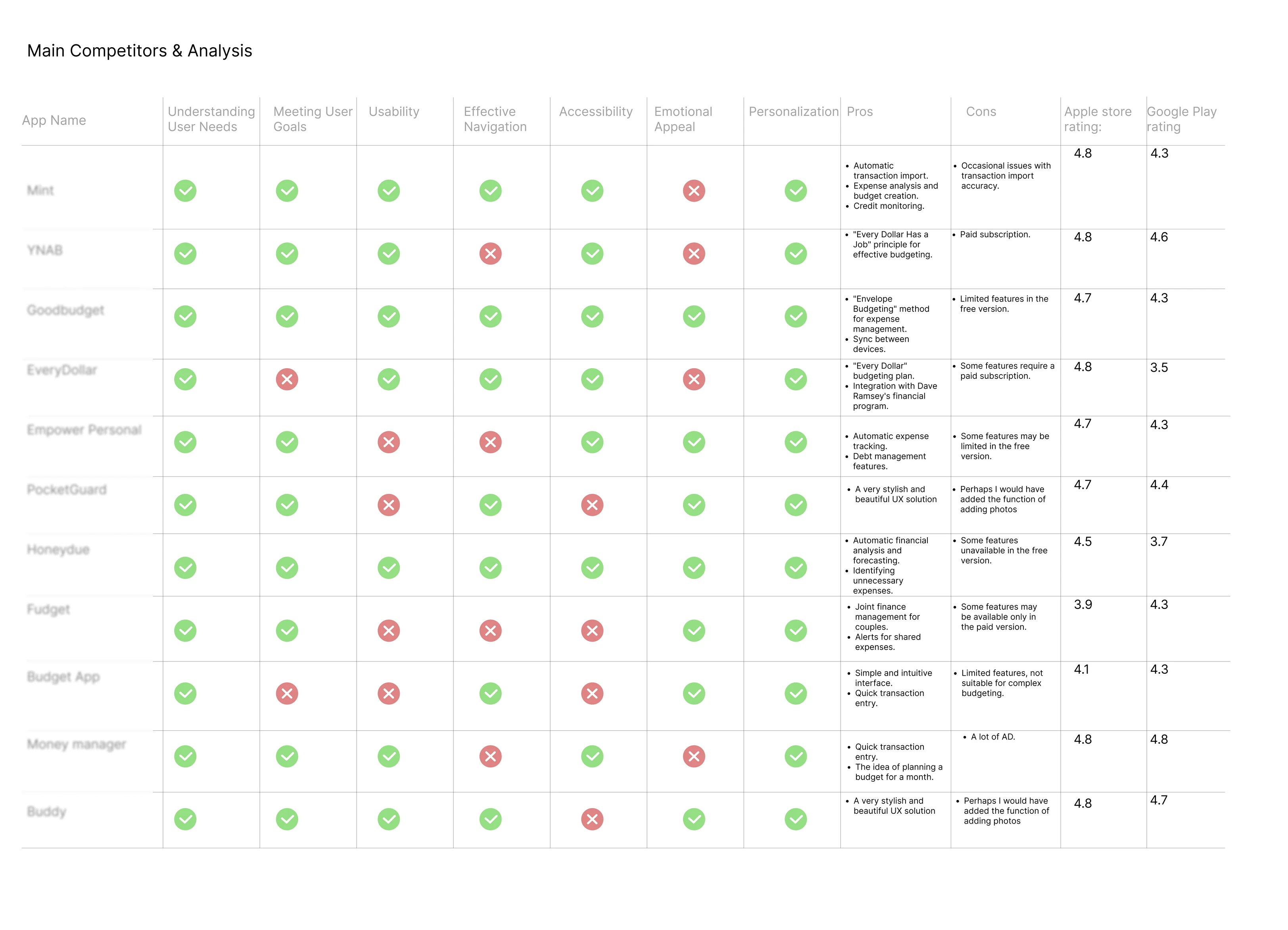
General overview and comparison of popular financial applications
I analysed existing financial management applications to identify successful UX patterns, common features and areas for improvement. The research focused on user needs, goals and overall experience, using insights from sources such as financial app reviews, app stores and user feedback.
All the data I used came from NerdWallet, the App Store, Google Play, user reviews and more.
Competitive benchmark
I compared two highly rated financial apps, Budget App and Buddy, across four criteria: onboarding, dashboard, adding money and additional features. This analysis helped identify common patterns, usability strengths and potential improvements to apply in Penny Pulse.
Interview
User interviews were conducted to explore users’ goals, challenges and expectations when managing their finances through digital applications. The findings revealed key user pain points and opportunities to improve the overall experience. All participant data was anonymised to ensure privacy and confidentiality.
Define
The Define phase distilled the research into a focused set of insights that set the priorities for everything that followed.
Based on the research findings, the following key insights guided the prototyping phase:
- Simplify finance tracking: make income, expenses and progress easy to understand.
- Personalise the experience: provide useful insights and recommendations based on user behaviour.
- Improve information clarity: create a dashboard that helps users quickly understand their finances.
- Reduce complexity: make key actions fast and simple to complete.
- Build user trust: ensure security, transparency and clear feedback.
- Support all users: design for both financially experienced users and beginners.
Design
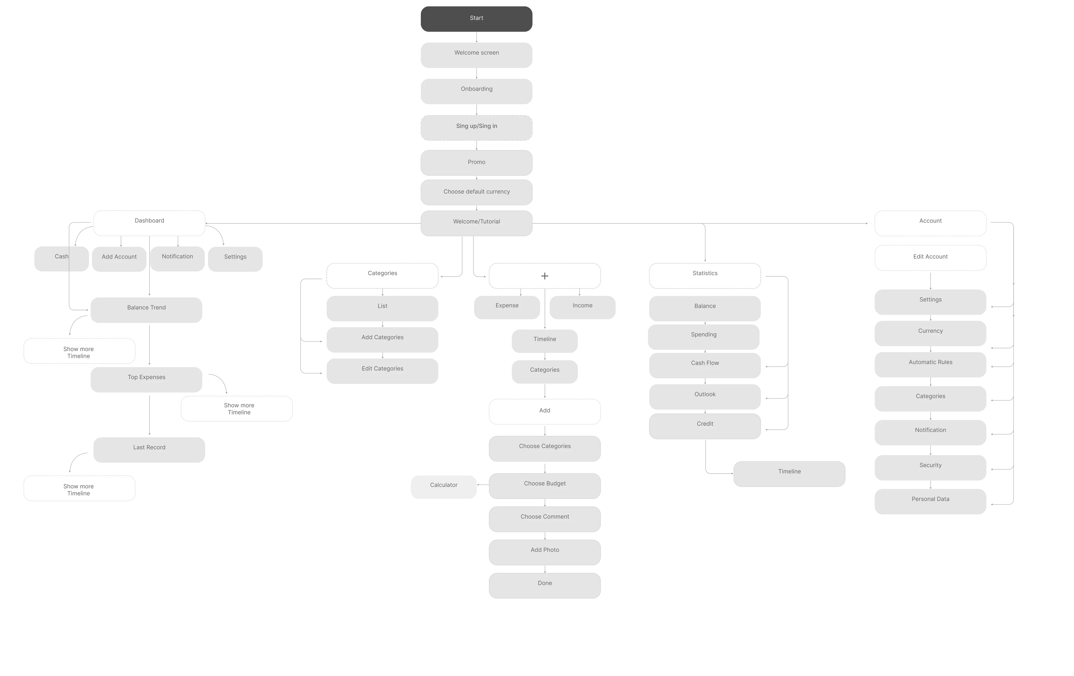
The Design phase turned those insights into the product itself — mapping the core user flow, prototyping the journey in Figma and building out the visual identity.
User flow
Prototyping
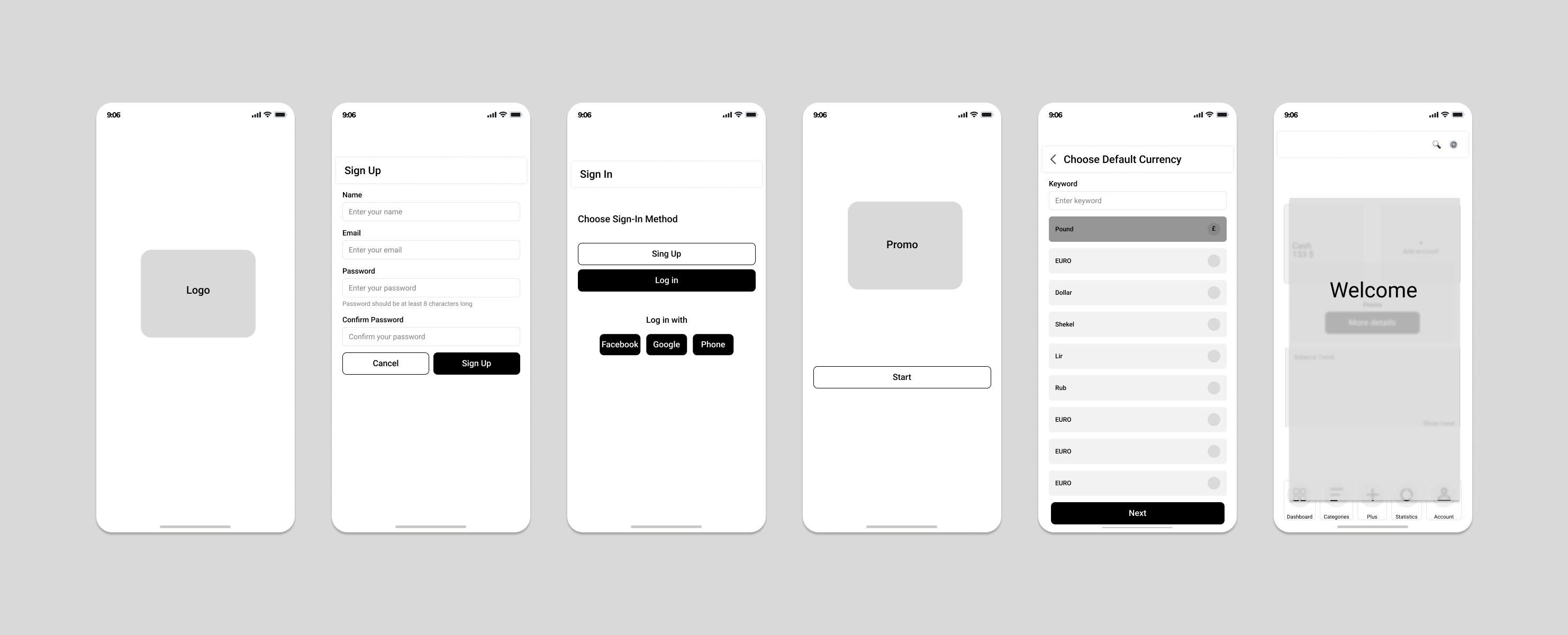
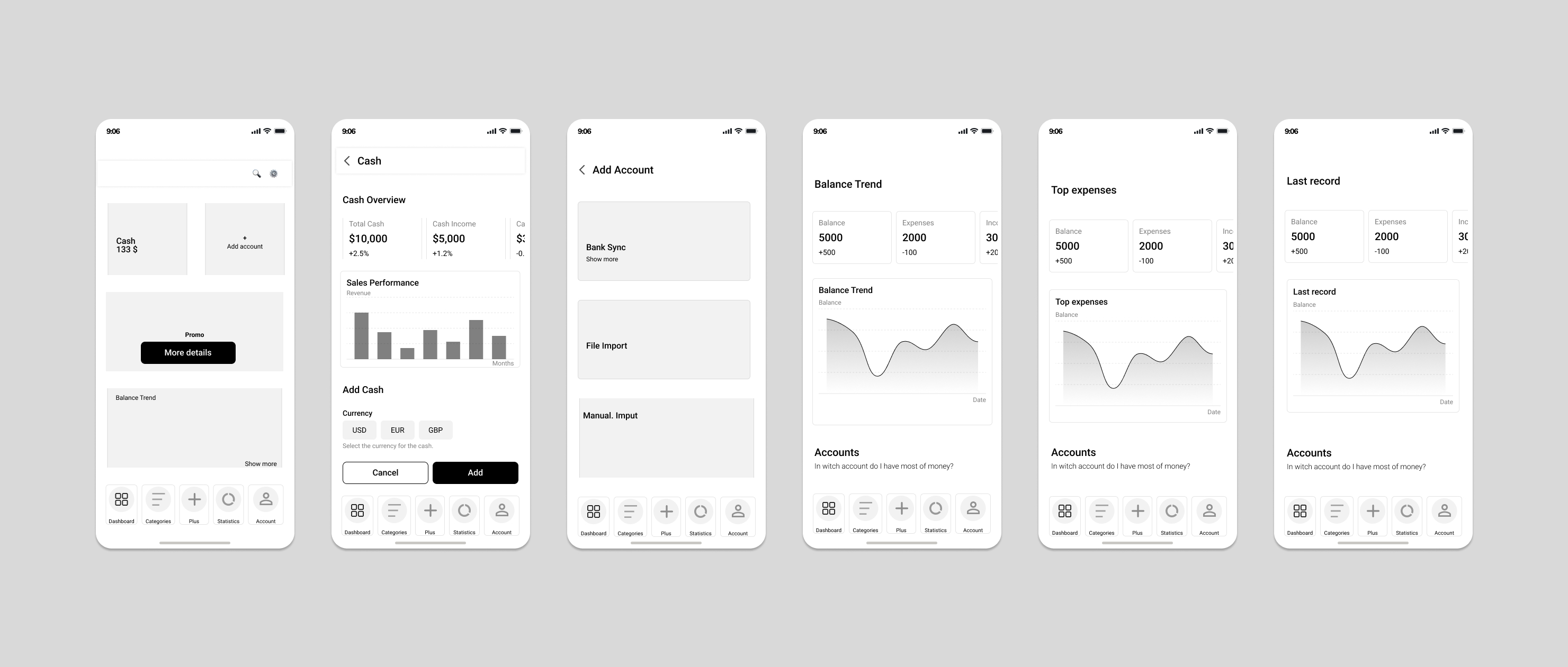
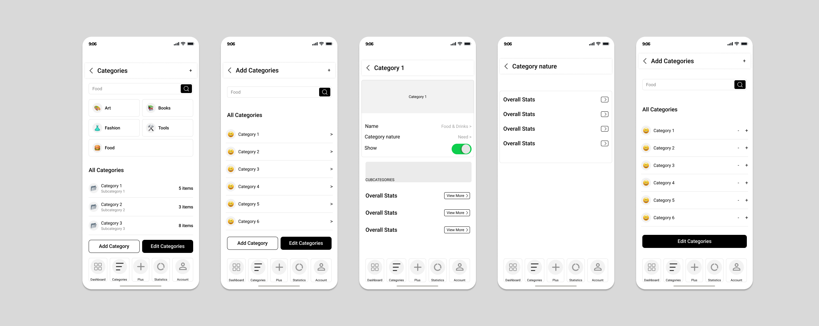
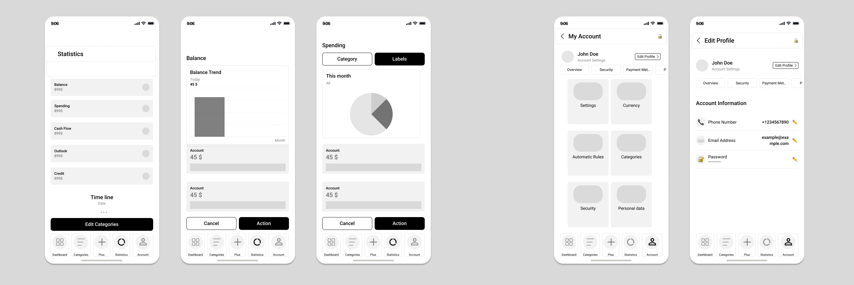
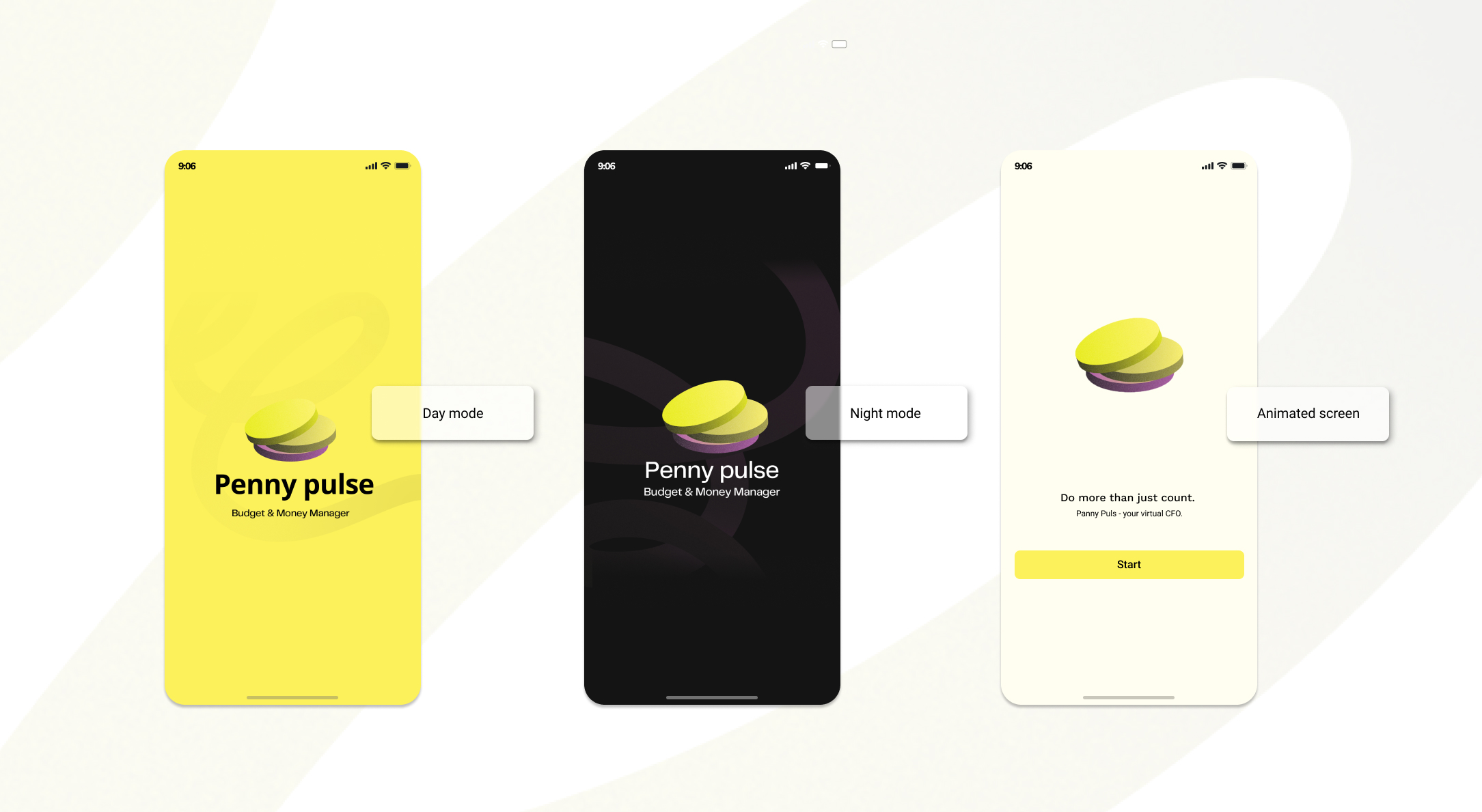
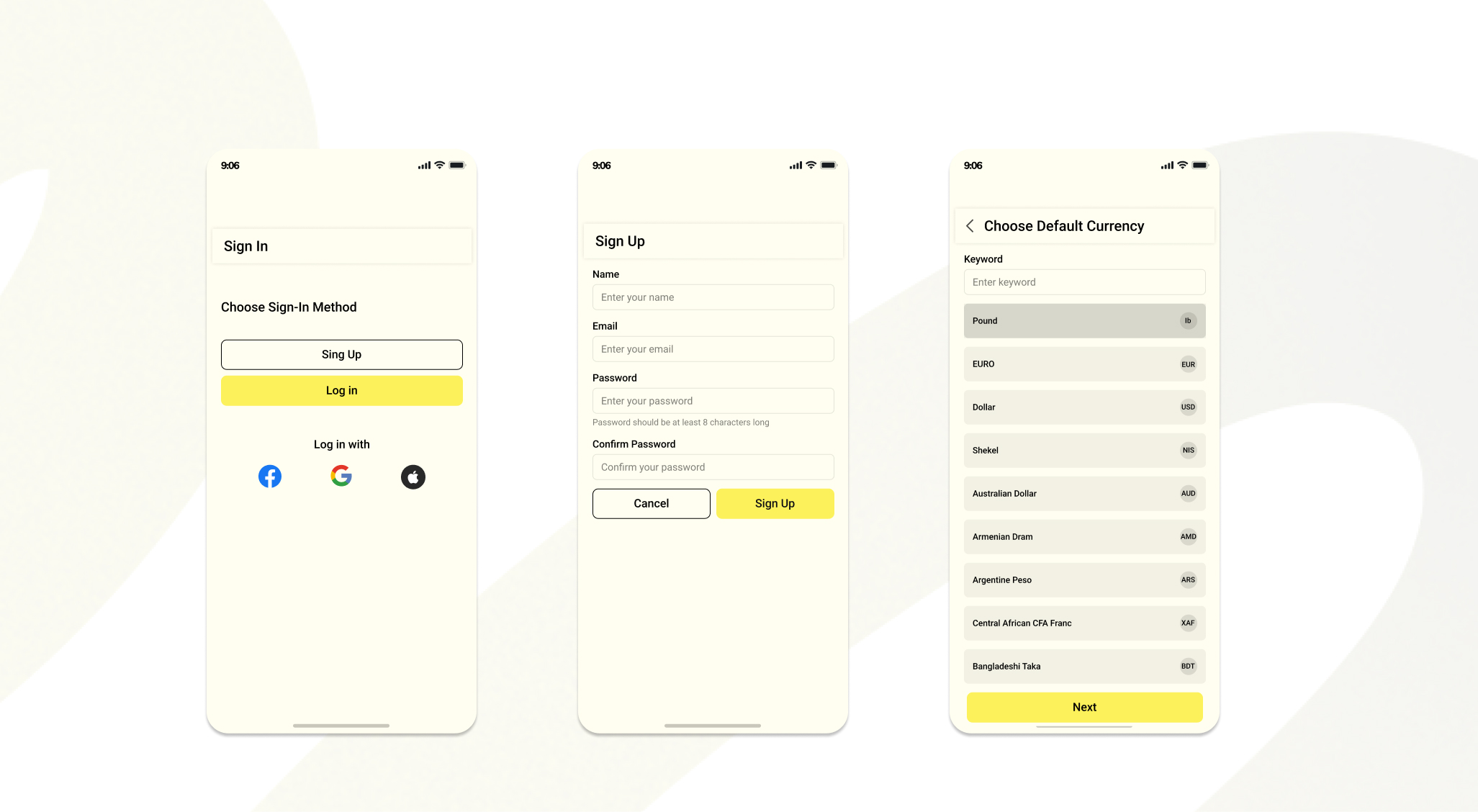
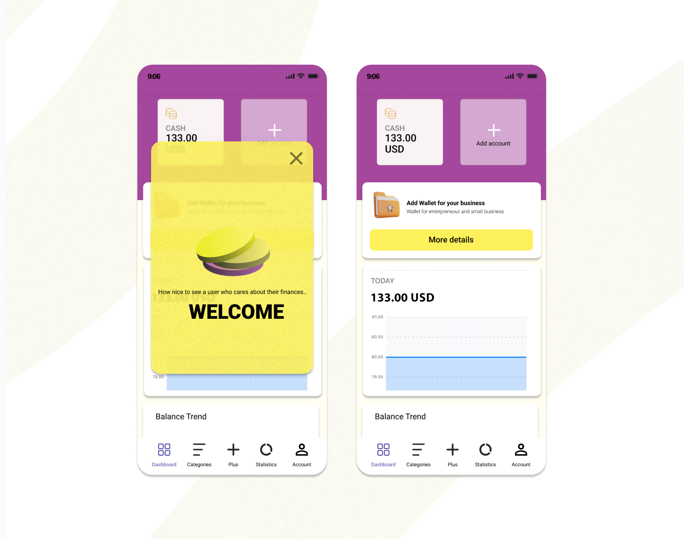
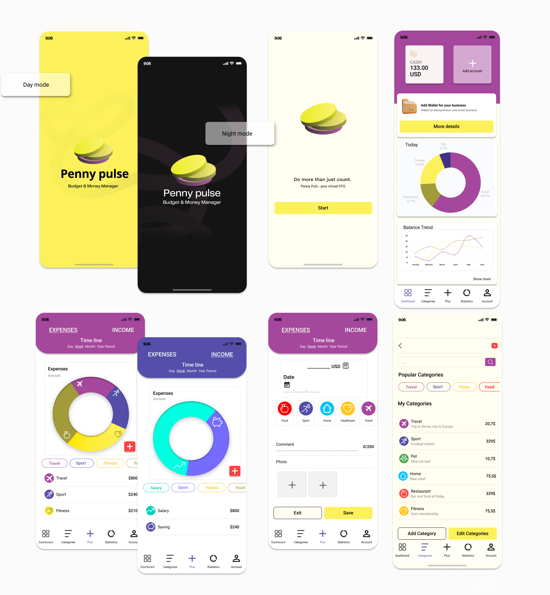
The prototype was created in Figma, focusing on a simple and efficient onboarding flow. The user journey starts with an animated logo, followed by account creation or login. Users are then introduced to the app through a short welcome message and asked to select their currency. Additional steps were removed to reduce friction and guide users quickly towards the main experience.
The prototypes were designed to create a clear and intuitive user experience while supporting a smooth user journey. User testing helped analyse behaviour, identify improvements and refine the design based on user needs and expectations. These insights guided further UI development and optimisation.
UI design
Font
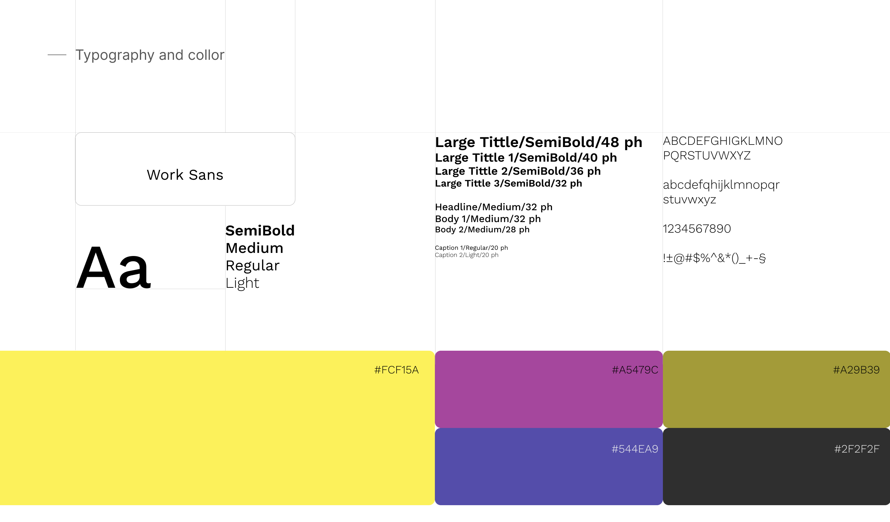
I chose Work Sans for its clean, modern style and excellent readability. Its range of weights helps create a clear visual hierarchy while maintaining a professional and consistent brand identity.
Open Grotesque style
Work Sans belongs to the Open Grotesque style, characterised by clean shapes, open letter forms and minimal decorative elements. This style supports modern, simple and highly readable interfaces. I selected it to create a clear and recognisable visual identity, ensuring the logo and interface remain professional and accessible.
Colours
Colour research was conducted to create a visual identity that supports brand recognition and user experience. The primary colour #FCF15A was selected for its association with coins and financial themes while also creating a warm and approachable feeling. It provides strong contrast with dark elements and creates a modern, distinctive appearance.
Additional colours were selected using colour harmony principles, creating a balanced palette that combines confidence, elegance and accessibility. The final colour system was tested for readability and contrast to ensure an inclusive user experience.
The prepared colour scheme, icons, controls and typography were applied consistently throughout the prototype to create a cohesive UI design.
Test
User testing shaped the design at every step, with prototype sessions used to observe behaviour, surface friction and refine the flow before further UI work.